
This line plot is useful when you have two continuos variables that are correlated to each other the association is a function of time. Particularly, I used this plot to visualize the dynamics in the association between the integrated gradient of a biomarker (TSH) to the target variable (LDL) accross several doctor visits in the DPV project.
First we need to load necessary R libraries.
        library(dplyr)
        library(ggplot2)
        library(RColorBrewer)
After finetuning the LLM, I extracted the integrated gradients of all the parameters to evaluate the feature importance. The input for the plot is a 500x50 matrix of gradient values of the biomarker for 500 samples and 50 timepoints.
Lineplot
Here I modify the input and make the plot:
        # Color scale for the biomarker
        col_fun <- colorRamp2(c(-2.5, 0, 6.5), c("deepskyblue4", "white", "coral4"))

        # Modify the matrix
        colnames(tsh) <- paste0("Visit",1:49) # 49 visits
        tsh <- pivot_longer(tsh, everything(), names_to = "Time", values_to = "Gradient")
        tsh$Time <- factor(tsh$Time, levels = paste0("Visit",1:49))
        tsh$Sample <- rep(paste0(1:500), each = 49) # 500 samples
        tsh$LDL <- rep(ldl, each = 49)

        # Apply the custom color function
        tsh$Color <- col_fun(tsh$LDL)

        # Plotting
        ggplot(tsh, aes(x = Time, y = Gradient, group = LDL, color = Color)) +
            geom_line(alpha = 0.8) +
            scale_color_identity() +  # Use the exact colors provided by col_fun
            theme_minimal() +
            theme(axis.text.x = element_text(angle = 45))
And here is the result:
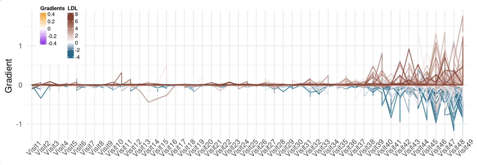
Assopciation between TSH's gradient and LDL overtime.