
Alluvial plot is versatile and useful in many situations. It can be used to describe the associations between the categories of two or three factor variables. In many cases alluvial plot can also visualize the flow or changes of one or more variables over time or different conditions. In this post I will demeonstrate the utility of alluvial plot in the latter case. Specifically, I will visualize the changes in data modality that a model uses across several training iterations, in the case of IMML model training.
First we need to load necessary R libraries.
        library(dplyr)
        library(ggplot2)
        library(ggalluvial)
        library(RColorBrewer)
In the case of my project, the input for the plot looks like this, which contains useful information that I got after the model training. The dataframe is saved as perf_roc in the environment.
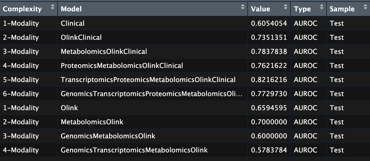
Model training information of IMML.
- Complexity: Increasing number of modalities used in each training iteration, from 1 to 6.
- Model: The actual modalities selected in the corresponding iteration
- Type, Value: The performance metric used and the model performance, respectively
- Sample: Either ‘Train’ or ‘Test’
Alluvial plot
First I processed the dataframe into a format suitable for plotting. Here’s how:
        # Add information of iterations and omics components
        perf <- perf_roc %>%
            mutate(Iteration = rep(1:100, each = 6),
                    Genomics = vector(mode = "numeric", length = nrow(perf_roc)),
                    Transcriptomics = vector(mode = "numeric", length = nrow(perf_roc)),
                    Proteomics = vector(mode = "numeric", length = nrow(perf_roc)),
                    Metabolomics = vector(mode = "numeric", length = nrow(perf_roc)),
                    Olink = vector(mode = "numeric", length = nrow(perf_roc)),
                    Clinical = vector(mode = "numeric", length = nrow(perf_roc)))

        # Label the omics components if they present in the model
        for (i in 1:nrow(perf)){
            perf$Genomics[i] <- ifelse(length(grep("Genomics",perf$Model[i])) > 0, 1, 0)
            perf$Transcriptomics[i] <- ifelse(length(grep("Transcriptomics",perf$Model[i])) > 0, 1, 0)
            perf$Proteomics[i] <- ifelse(length(grep("Proteomics",perf$Model[i])) > 0, 1, 0)
            perf$Metabolomics[i] <- ifelse(length(grep("Metabolomics",perf$Model[i])) > 0, 1, 0)
            perf$Olink[i] <- ifelse(length(grep("Olink",perf$Model[i])) > 0, 1, 0)
            perf$Clinical[i] <- ifelse(length(grep("Clinical",perf$Model[i])) > 0, 1, 0)
        }

        # Transform into a long table
        perf <- pivot_longer(perf, cols = Genomics:Clinical, names_to = "Data", values_to = "Comb") %>%
            filter(Comb == 1)

        # Trim off unnecessary rows in the dataframe
        df_list <- list()
        for (i in 1:100){
            tmp <- filter(perf, Iteration == i)
            df_list[[i]] = list()
            for (j in 1:6){
                if (j == 1){
                    df <- filter(tmp, Complexity == "1-Modality" & Iteration == i)
                    df_list[[i]][[j]] <- df
                } else {
                    comp <- paste0(j,"-Modality")
                    comp0 <- paste0(j-1,"-Modality")
                    mod <- filter(tmp, Complexity == comp)$Data %>% as.character()
                    mod0 <- filter(tmp, Complexity == comp0)$Data %>% as.character()
                    mol <- setdiff(mod,mod0)
                    df <- filter(tmp, Complexity == comp & Data == mol)
                    df_list[[i]][[j]] <- df
                }
            }
            df_list[[i]] <- do.call(rbind, df_list[[i]])
        }
        perf_fil <- do.call(rbind, df_list) %>% arrange(Iteration, Complexity)
        perf_fil$Data <- factor(perf_fil$Data, levels = c("Genomics",
                                                        "Transcriptomics",
                                                        "Proteomics",
                                                        "Metabolomics",
                                                        "Olink",
                                                        "Clinical"))
The final table perf_fil would look like this, where the Data column shows the new modality that was added to the model in the corresponding iteration.
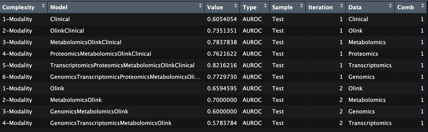
Post processed table of model training information.
Then I simply made the plot:
        ggplot(perf_fil,
                aes(x = Complexity, stratum = Data, alluvium = Iteration, fill = Data, label = Data)) +
        scale_fill_manual(values = color_types) +
        geom_flow(stat = "alluvium", lode.guidance = "frontback") +
        geom_stratum(color = NA) +
        theme(axis.text.x = element_text(angle = 45, hjust = 1, vjust = 1),
                panel.background = element_rect(fill = "white",
                                        colour = "white",
                                        size = 0.5, linetype = "solid"),
                panel.grid.major = element_line(size = 0.25, linetype = 'solid',
                                        colour = "grey"),
                panel.grid.minor = element_line(size = 0.25, linetype = 'solid',
                                        colour = "grey"))
The result looks like this:
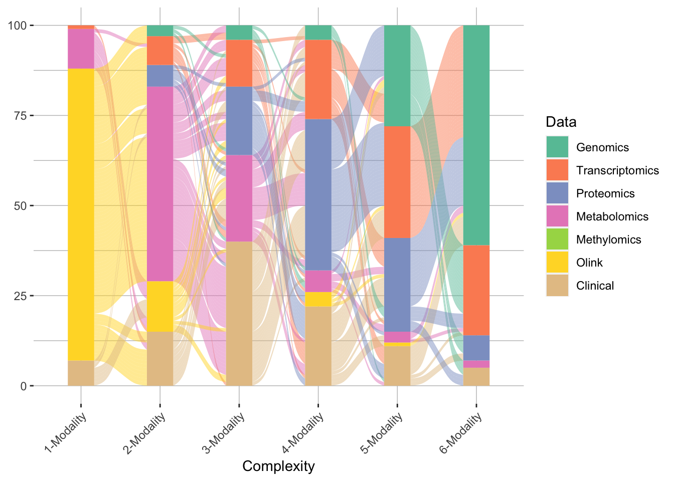
Modality trajectory of model training
The plot shows the model complexity on the x-axis and and each alluvium (wavy line) represent one training iteration with its color represents the modality.
We could go one step further and plot the prediction performance as a boxplot on top of the alluvial plot to show more information.
        a <- ggplot(sel_inc3_roc, aes(x = Complexity, y = Value)) +
            geom_boxplot(fill = "deepskyblue4", outlier.shape = NA) +
            geom_point(alpha = 0.5) +
            theme(text = element_text(size = 18),
                    axis.text.x = element_text(angle = 45, hjust = 1, vjust = 1),
                    legend.position = "none", axis.title.x = element_blank(),
                    panel.background = element_rect(fill = "white",
                                            colour = "white",
                                            size = 0.5, linetype = "solid"),
                    panel.grid.major = element_line(size = 0.25, linetype = 'solid',
                                            colour = "grey"),
                    panel.grid.minor = element_line(size = 0.25, linetype = 'solid',
                                            colour = "grey")) +
            ylab("AUROC") +
            stat_compare_means(comparisons = list( c("1-Modality", "3-Modality")),method = "wilcox.test")
        b <- ggplot(perf_fil,
                aes(x = Complexity, stratum = Data, alluvium = Iteration, fill = Data, label = Data)) +
            scale_fill_manual(values = color_types) +
            geom_flow(stat = "alluvium", lode.guidance = "frontback") +
            geom_stratum(color = NA) +
            theme(axis.text.x = element_text(angle = 45, hjust = 1, vjust = 1),
                    panel.background = element_rect(fill = "white",
                                            colour = "white",
                                            size = 0.5, linetype = "solid"),
                    panel.grid.major = element_line(size = 0.25, linetype = 'solid',
                                            colour = "grey"),
                    panel.grid.minor = element_line(size = 0.25, linetype = 'solid',
                                            colour = "grey"))
        egg::ggarrange(a,b, nrow = 2, heights = c(1,1))
The final plot would look like this:
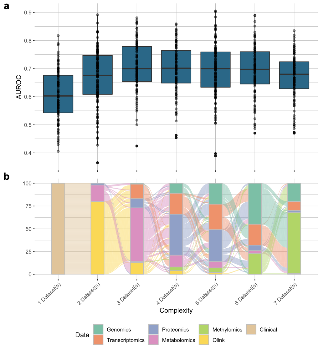
Trajectory of the model complexity and their prediction performance.