
Here I’m not sure the exact name of this kind of plot, Google didn’t really help, so I call it waterfall plot for now, due to the resemblance. This plot is useful when you want to visualize the ranking of the samples of many categories and their quantitative properties at the same time. Particularly, I used this plot to visualize the samples ranked according to their prediction probabilities (in a classification task) and their actual prediction probabilities accross cross-valiation iterations.
First we need to load necessary R libraries.
        library(dplyr)
        library(ggplot2)
        library(RColorBrewer)
The input is a dataframe of the prediction probabilities across interations and the true outcome:
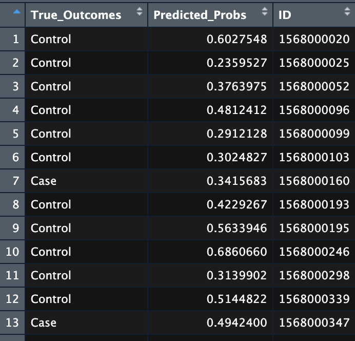
Dataframe of prediction probabilities and the true outcome.
Waterfall plot
Then I simply use ggplot2 to make the plot:
        ggplot(predobs_inc3,
            aes(x=reorder(as.character(ID),Predicted_Probs, mean),
            y = Predicted_Probs, col = True_Outcomes)) +
            geom_boxplot(width = 0.05, outlier.shape = NA) +
            ggpubr::color_palette("jco") +
            labs(col = "Observations") +
            xlab("Samples") +
            ylab("Prediction probabilities") +
            theme(panel.background = element_rect(fill = "white"),
                    axis.text.x = element_blank(),
                    axis.ticks.x = element_blank(),
                    axis.title.x = element_blank())
The result shows distribution (locations) of the sample as x-axis and their prediction probabilities in the y-axis. More importantly in the case of my project, the plot shows the relative distribution of the true outcomes, case and controls.
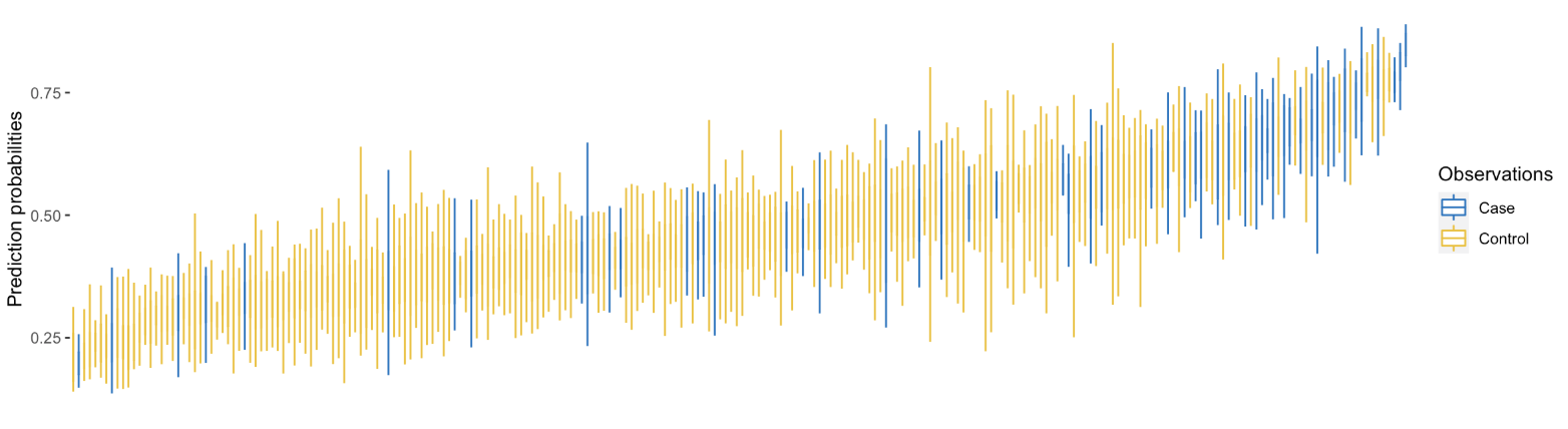
Waterfall plot of sample distribution.
We could go one step further and visualize the quantity of the important biomarkers corresponding to the samples. To this end, we need one more table df:
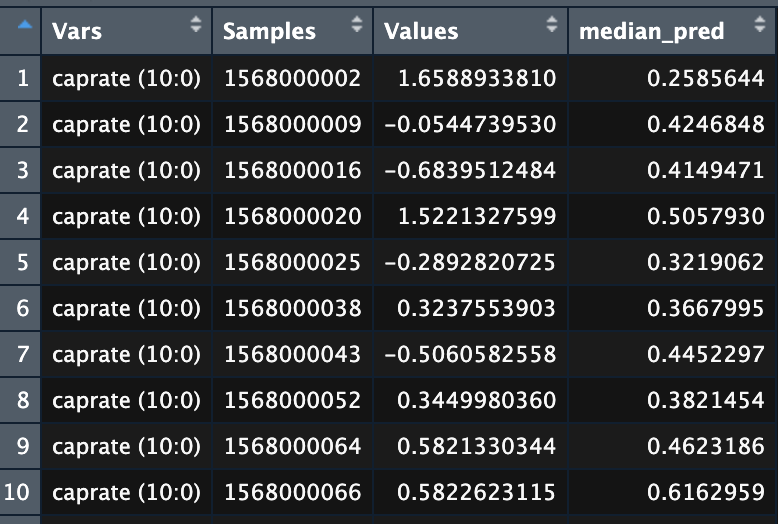
Levels of biomarkers for the samples.
- Vars: Name of the biomarkers
- Sample: Sample IDs
- Values: Biomaker level
- Median_pred: Median of the prediction probabilities of the samples
Then we add the biomarker levels below the waterfall plot as heatmaps.
        # Waterfall plot
        a <- ggplot(predobs,
            aes(x=reorder(as.character(ID),Predicted_Probs, mean),
            y = Predicted_Probs, col = True_Outcomes)) +
            geom_boxplot(width = 0.05, outlier.shape = NA) +
            ggpubr::color_palette("jco") +
            labs(col = "Observations") +
            xlab("Samples") +
            ylab("Prediction probabilities") +
            theme(panel.background = element_rect(fill = "white"),
                    axis.text.x = element_blank(),
                    axis.ticks.x = element_blank(),
                    axis.title.x = element_blank())
        # Heatmap for OLINK markers
        b <- ggplot(filter(df, Vars %in% olink_anno$SYMBOL),
                    aes(x = reorder(Samples, median_pred),
                    y = Vars,
                    fill = Values))+
            geom_tile() +
            scale_fill_gradient2(low="white", high="#FFD92F") +
            theme(axis.text.x = element_blank(),
                    axis.title.y = element_blank(),
                    axis.ticks.x = element_blank(),
                    axis.title.x = element_blank())
        # Heatmap for metabolomic markers
        c <- ggplot(filter(df, Vars %in% c(meta_anno$Biochemical_F4,"linolenate (18:3n3/6)","DHEA-S")),
                    aes(x = reorder(Samples, median_pred),
                    y = Vars,
                    fill = Values))+
            geom_tile() +
            scale_fill_gradient2(low="white", high="#E78AC3") +
            theme(axis.text.x = element_blank(),
                    axis.title.y = element_blank(),
                    axis.ticks.x = element_blank(),
                    axis.title.x = element_blank())
        # Heatmap for transcriptomic markers
        d <- ggplot(filter(df, Vars %in% tra_anno$SYMBOL),
                    aes(x = reorder(Samples, median_pred),
                    y = Vars,
                    fill = Values))+
            geom_tile() +
            scale_fill_gradient2(low="white", high="#FC8D62") +
            theme(axis.text.x = element_blank(),
                    axis.title.y = element_blank(),
                    axis.ticks.x = element_blank(),
                    axis.title.x = element_blank())
        # Heatmap for clinical markers
        e <- ggplot(filter(df, Vars %in% c("Age","Low physical activity")),
                    aes(x = reorder(Samples, median_pred),
                    y = Vars,
                    fill = Values))+
            geom_tile() +
            scale_fill_gradient2(low="white", high="#E5C494") +
            theme(axis.text.x = element_blank(),
                    axis.title.y = element_blank(),
                    axis.ticks.x = element_blank(),
                    axis.title.x = element_blank())
Here is the final result:
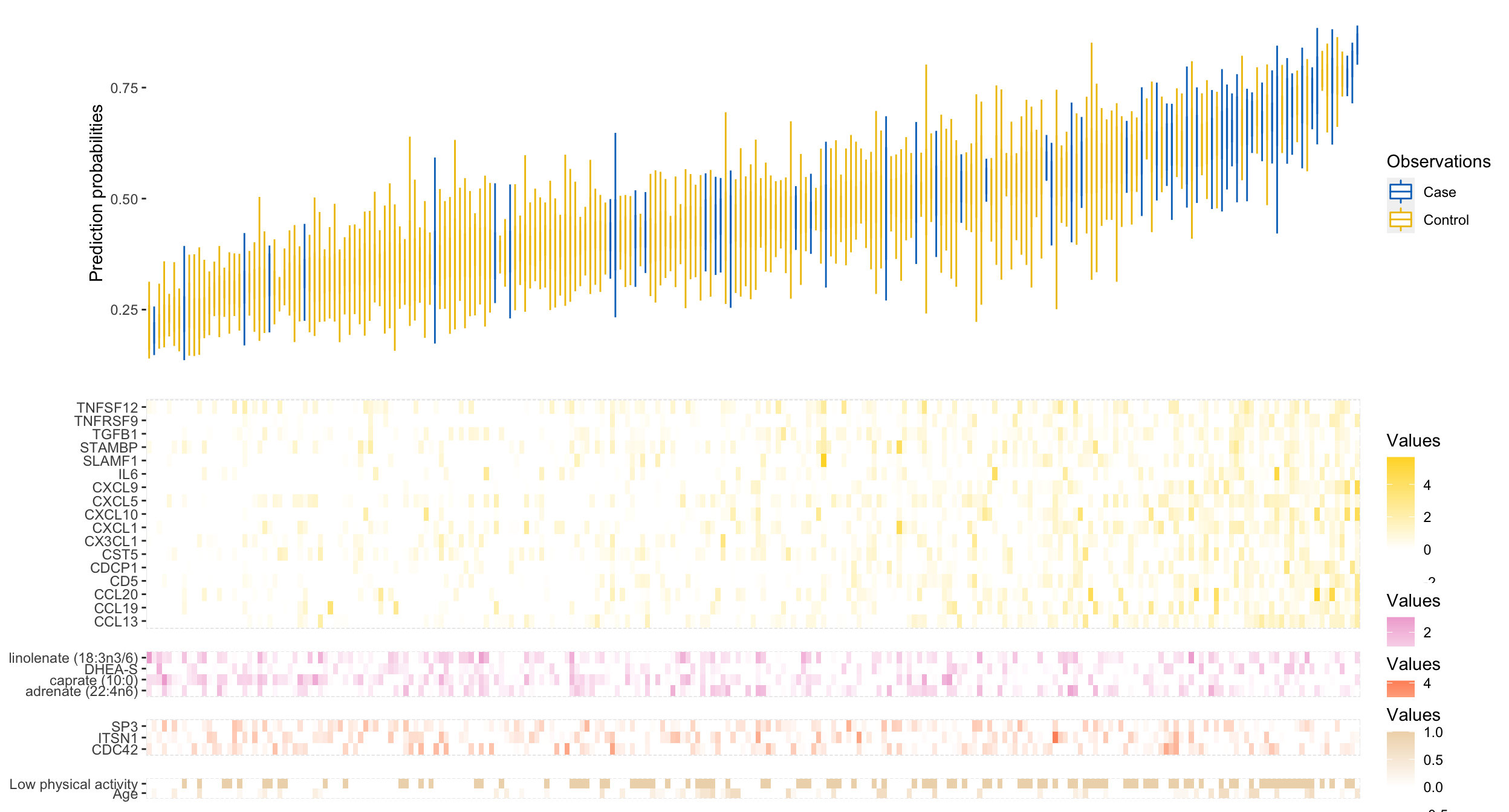
Waterfall plot coupled with heatmaps of biomarkers.