
In this case I have a multiomic dataset, each omics has its own properties including number of features, number of samples and predictive performance for a phenotype. I was evaluating the performance of combinations of these omics and wanted to visualize the result. First I will give a descriptive vizualization of the dataset using UpSet plot and then prediction performance of the possible combinations using boxplot and tileplot.
First we need to load necessary R libraries.
        library(dplyr)
        library(ggplot2)
        library(ComplexHeatmap)
        library(RColorBrewer)
UpSet plot
UpSet plot is useful to visualize set data with many intersecting sets, such as our multiomic dataset. The list of all samples in the multiomic dataset is provided as a dataframe of sample IDs. Each column represent one omic. IDs that belong to the same sample are in the same row, missing data is shown as NA.
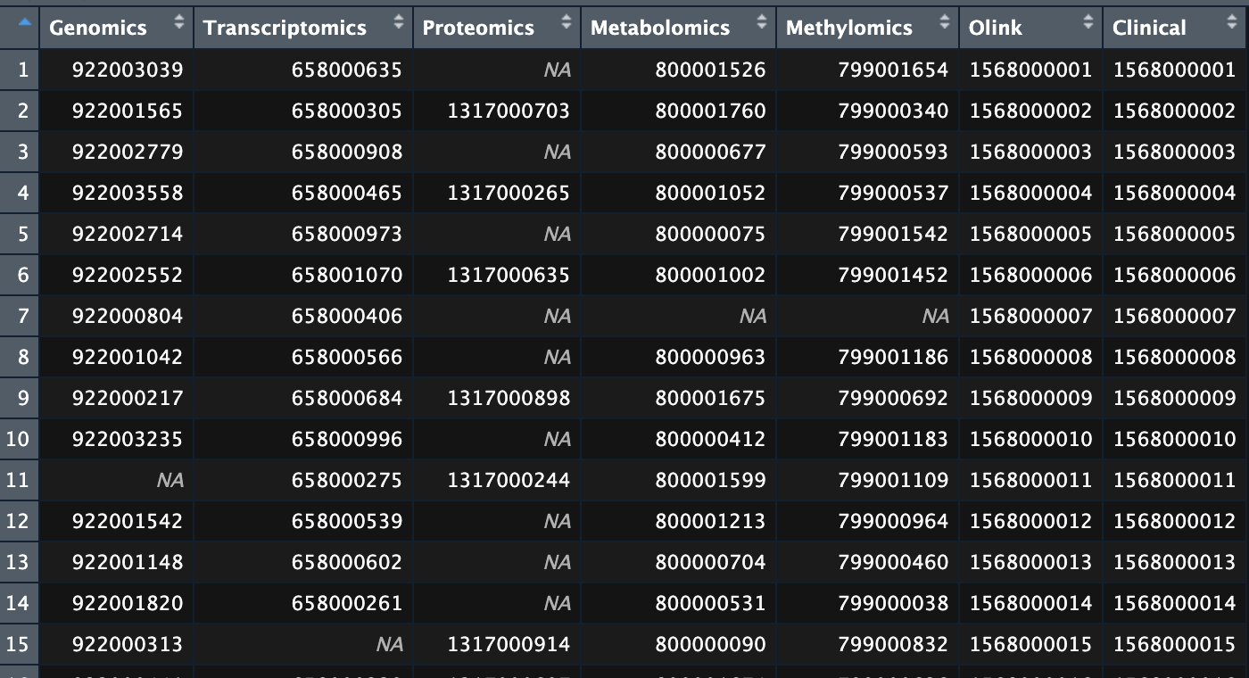
Dataframe of sample IDs for the multiomic dataset.
Then go a head and make the UpSet plot:
        # Extract samples of each omic and represent with a single ID type (Clinical)
        gen <- as.character(omics_id$Clinical)[!is.na(omics_id$Genomics)]
        tra <- as.character(omics_id$Clinical)[!is.na(omics_id$Transcriptomics)]
        pro <- as.character(omics_id$Clinical)[!is.na(omics_id$Proteomics)]
        meta <- as.character(omics_id$Clinical)[!is.na(omics_id$Metabolomics)]
        meth <- as.character(omics_id$Clinical)[!is.na(omics_id$Methylomics)]
        oli <- as.character(omics_id$Clinical)[!is.na(omics_id$Olink)]

        # Put them into a list
        l <- list(Genomics = gen,
                Transcriptomics = tra,
                Proteomics = pro,
                Metabolomics = meta,
                Methylomics = meth,
                ClinicalData_InflamatoryProteins = oli)

        # Make a combination matrix
        m <- make_comb_mat(l, mode = "intersect") # Make intersections of sets

        # Set a color scheme
        color_types <- brewer.pal(7,"Set2")
        names(color_types) <- c("Genomics",
                                "Transcriptomics",
                                "Proteomics",
                                "Metabolomics",
                                "Methylomics",
                                "Olink",
                                "Clinical")

        # Make UpSet plot
        UpSet(m,
            set_order = names(l),
            comb_order = order(comb_size(m)), # Order based on size of the sets
            right_annotation = upset_right_annotation(m, # Setting for annotation of the sets
                            add_numbers = TRUE,
                            gp = gpar(fill = color_types, col = "white")),
            column_names_rot = 45,
            pt_size = unit(1,"mm"),
            lwd = 1)
Here is the result:
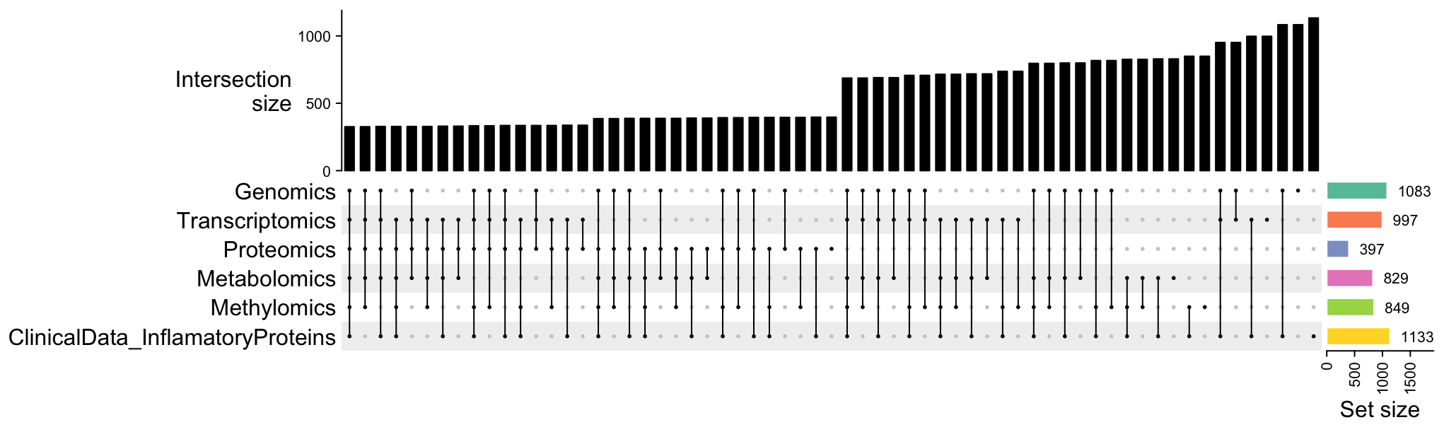
Upset plot of the sample distribution among datasets.
Documentation of how to adjust other parameters of the UpSet plot and other functions of the package ComplexHeatmap could read here.
Boxplot and Tileplot
Next I would like to visualize the prediction performance of different combinations of omics as features of the model. After the model training, I got this dataframe as result:
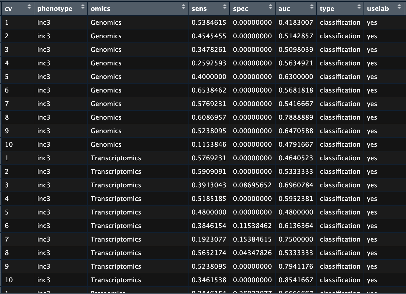
Prediction performance of the multiomic models.
where each column shows result of a cross-validation iteration:
- cv: 10-fold cross-validation, one iteration per row
- phenotype: the target variable
- omics: single omics or combinations of omics
- sens, spec, auc: performance metrics, sensitivity, specificity and AUROC respectively
- type: either ‘classification’ or ‘regression’
- uselab: whether I used laboratory measurement as features or not
Here the dataframe was named cv in the R environment. The goal is to show the evaluated combinations of omics and the prediction performance for each combination at the same time. To this end I used tileplot to make the former and boxplot to make the latter, then used the cowplot package to combine the two with matched coordinate. Here is details how to do it:
        # Rank the combinations based on median AUROC
        cv_tmp <- filter(cv, uselab != "no") %>% # Only consider iterations that 'uselab'
            dplyr::select(omics, auc) %>%
            group_by(omics) %>%
            summarise(med = median(auc, na.rm = T)) %>%
            arrange(.,desc(med)) %>% # Descending order
            mutate(rank = 1:nrow(.)) # Add ranking

        # Append a zeros matrix with each column represents one omics
        cv_tmp <- cv_tmp %>%
        mutate(Genomics = vector(mode = "numeric", length = nrow(cv_tmp)),
                Transcriptomics = vector(mode = "numeric", length = nrow(cv_tmp)),
                Proteomics = vector(mode = "numeric", length = nrow(cv_tmp)),
                Metabolomics = vector(mode = "numeric", length = nrow(cv_tmp)),
                Methylomics = vector(mode = "numeric", length = nrow(cv_tmp)),
                Olink = vector(mode = "numeric", length = nrow(cv_tmp)),
                Covariate = vector(mode = "numeric", length = nrow(cv_tmp)))

        # Transform the zeros matrix into a binary matrix showing whether the omics presents in the combination or net
        for (i in 1:nrow(cv_tmp)){
            cv_tmp$Genomics[i] <- ifelse(length(grep("Genomics",cv_tmp$omics[i])) > 0, 1, 0)
            cv_tmp$Transcriptomics[i] <- ifelse(length(grep("Transcriptomics",cv_tmp$omics[i])) > 0, 1, 0)
            cv_tmp$Proteomics[i] <- ifelse(length(grep("Proteomics",cv_tmp$omics[i])) > 0, 1, 0)
            cv_tmp$Metabolomics[i] <- ifelse(length(grep("Metabolomics",cv_tmp$omics[i])) > 0, 1, 0)
            cv_tmp$Methylomics[i] <- ifelse(length(grep("Methylomics",cv_tmp$omics[i])) > 0, 1, 0)
            cv_tmp$Olink[i] <- ifelse(length(grep("Olink",cv_tmp$omics[i])) > 0, 1, 0)
            cv_tmp$Covariate[i] <- 1
        }

        # Transform into a long table
        cv_tmp <- pivot_longer(cv_tmp, cols = Genomics:Covariate, names_to = "Type")
        cv_tmp$size <- rep(300, each = nrow(cv_tmp))

        # Add the ranking to the CV dataframe
        cv$rank <- cv_tmp$rank[match(cv$omics,cv_tmp$omics)]

        # Plot AUROC
        p1 <- ggplot(cv,
                    aes(x = reorder(omics, desc(rank)),
                    y = auc,
                    fill = uselab,
                    col = uselab))+
                geom_boxplot(position = "identity", alpha = 0.5) +
                geom_hline(yintercept = 0.5, col = "blue") +
                xlab("Omics") +
                ylab("AUROC") +
                theme(legend.position = "left", axis.text.y = element_blank()) +
                coord_flip()
        # Plot sensitivity
        p2 <- ggplot(cv,
                    aes(x = reorder(omics, desc(rank)),
                    y = sens,
                    fill = uselab,
                    col = uselab))+
                geom_boxplot(position = "identity", alpha = 0.5) +
                xlab("Omics") +
                ylab("Sensitivity") +
                theme(legend.position = "none", axis.title.y = element_blank(),axis.text.y = element_blank()) +
                coord_flip()
        # Plot specificity
        p3 <- ggplot(cv,
                    aes(x = reorder(omics, desc(rank)),
                    y = spec,
                    fill = uselab,
                    col = uselab))+
            geom_boxplot(position = "identity", alpha = 0.5) +
            ylab("Specificity") +
            theme(legend.position = "none", axis.title.y = element_blank(), axis.text.y = element_blank()) +
            coord_flip()
        # List of combinations
        o_list <- unique(cv_tmp$omics) %>% as.character()
        # Plot the combination names
        p4 <- ggplot(cv_tmp) +
                geom_tile(aes(x=Type,
                        y=reorder(omics,desc(rank)),
                        fill = factor(value)),
                        colour="white",
                        size=0.5) +
                geom_text(aes(x=Type,
                        y=reorder(omics,desc(rank)),
                        label=ifelse(value==1, substr(Type,1,4), "")), colour="white",
                        size=2) +
                theme(axis.title =element_blank(),
                    axis.text.y = element_blank(),
                    axis.text.x=element_text(angle=-90, hjust=0, vjust=0.5)
                ) +
                scale_fill_manual(values=c("grey90", "grey30")) +
                geom_rect(data = filter(cv_tmp, omics == "MetabolomicsOlink"),
                            aes(xmin=-Inf, xmax=Inf, ymin=nlevels(cv_tmp$omics) - which(o_list == "ProteomicsMetabolomicsOlink")-0.5 + 1,
                            ymax=nlevels(cv_tmp$omics) - which(o_list=="ProteomicsMetabolomicsOlink")+0.5 + 1),
                            fill = "red", alpha = 0.05)+ # Label the best performing combination
                guides(fill=FALSE, alpha = FALSE, col = F)

        # Put everything together
        ggarrange(p1,p2,p3,p4, ncol = 4, align = "hv", widths = c(2,2,2,1.5))
And here is the result:
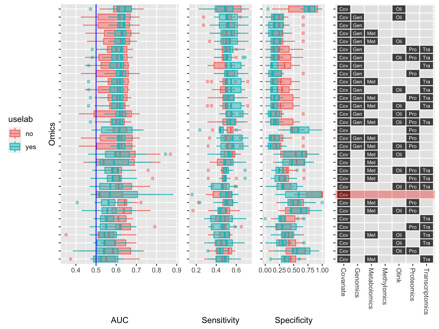
Prediction performance of the multiomic models.
The plot nicely show the combinations of omics that I evaluated using the tileplot on the right and their corresponding prediction performance using the boxplots on the left.